Inspired Aging Campaign for Surrey Services

I am very fortunate. I knew all of my grandparents. They remained part of my life well into my adulthood. In fact, my maternal grandmother, who I adored, lived to 105. My parents and mother-in-law are in their nineties. Years ago, with my young children in tow, I delivered meals on wheels to seniors in our community. Older people have always held a warm spot in my heart.
Opportunities to learn, socialize and get quality guidance on health care, home assistance and transportation are key to healthy aging. And when an older person wants to live independently in their own home, Surrey Services for Seniors provides this essential access.
I am delighted to work with Surrey Services on a variety of projects. This one was to create a logo and collateral material for their Inspired Aging Campaign, a five-year campaign to raise $15,000,000 to support their work.
The logo’s bright colors and swirling, energetic lines convey the vitality of the Surrey community.
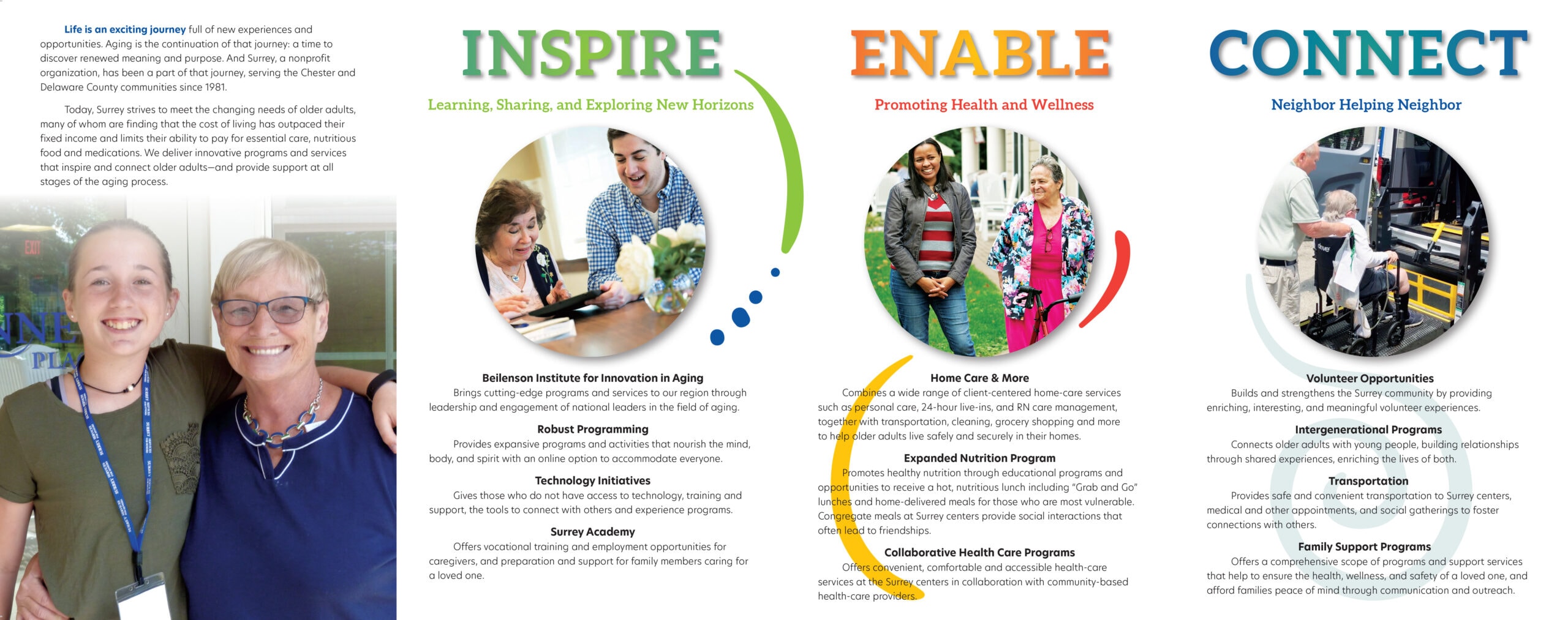
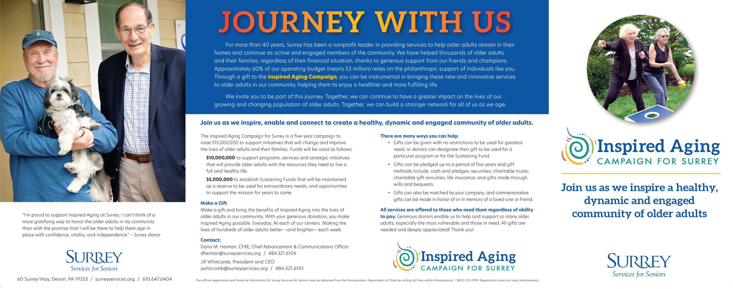
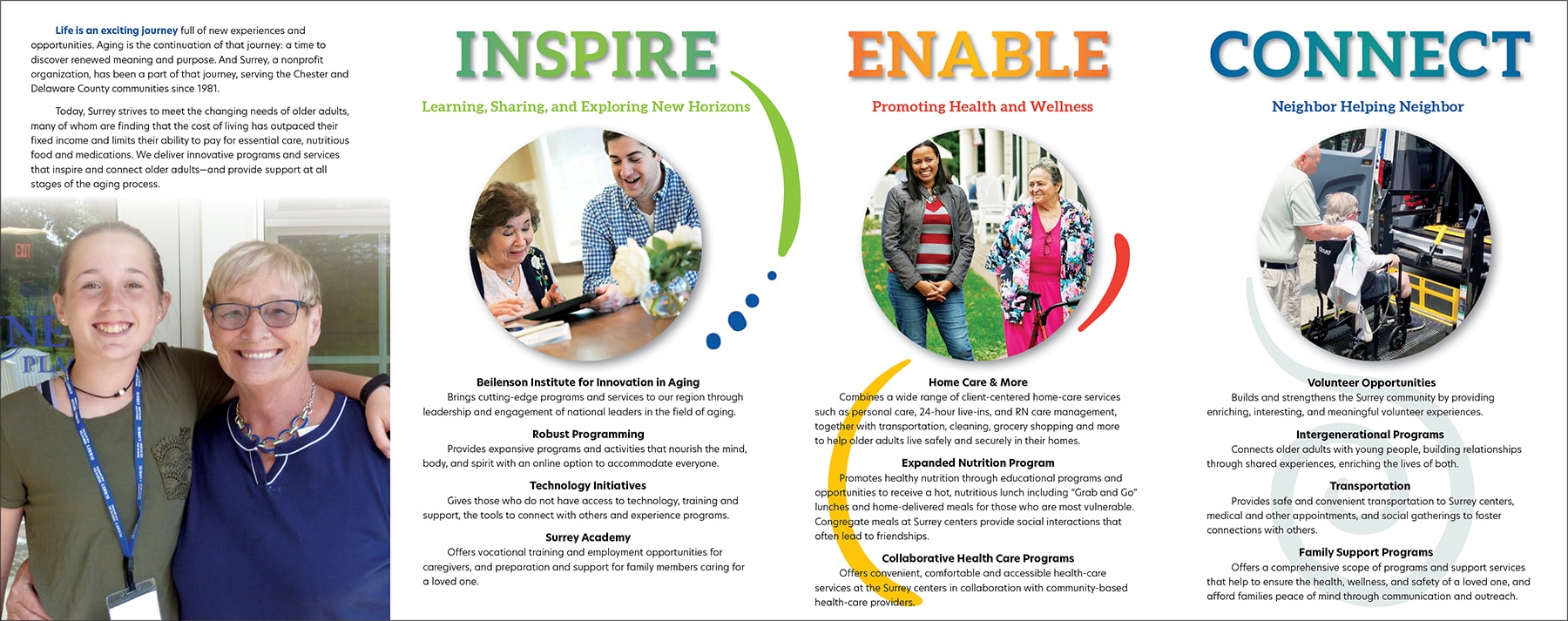
The four-panel Case for Support brochure (below) folds out accordion-style. Each panel highlights one of Surrey’s pillars: Inspire. Enable. Connect. The gradient type treatment emphasizes Surrey’s active, robust and friendly nature. The copy outlines the campaign’s goals as well as ways to give.
Part of a Team
I love being part of Surrey’s team that includes Maureen McKnight and Dana Heiman with Jill Whitcomb at the helm. I recently had lunch with Maureen and Dana at the Surrey Cafe located at their Devon headquarters. Everything was fresh, clean and delicious. But it was the spirit in the space, the friendly smiles, the delight on the faces of the volunteer servers that really impressed me. When they say “a healthy, dynamic and engaged community of older adults,” they mean it.
We used the Inspired Aging logo as the theme of this year’s annual report which I also designed. See the report here.
Client:
Surrey Services
Services:
Logo design
Case for support brochure design
Do you need materials to support your nonprofit’s capital campaign? Get in touch to see how I can help.

This is the interior of the brochure when opened up flat. There are 4 panels. The brochure is 24 inches wide.
The first 3 panels on the left are the back of the piece. The panel on the far right is the front cover.


