Rebranding Package for Arts Organization:
Wolf Performing Arts Center
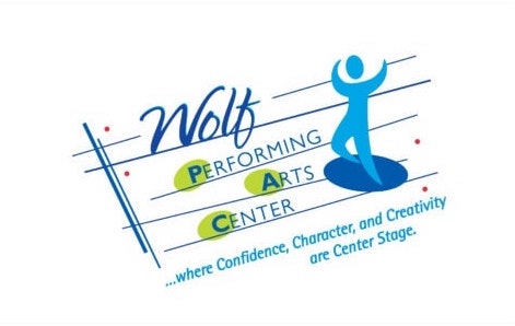
It’s always fun to see the “Before” and “After” in a re-branding project. In this case, the goal was to remain youthful and playful, but add a little sophistication to the look of the logo. The palette in both is similar and “Wolf” still has energy but the words are easier to read. The red and yellow dots feel like the lights on a theater marquis.
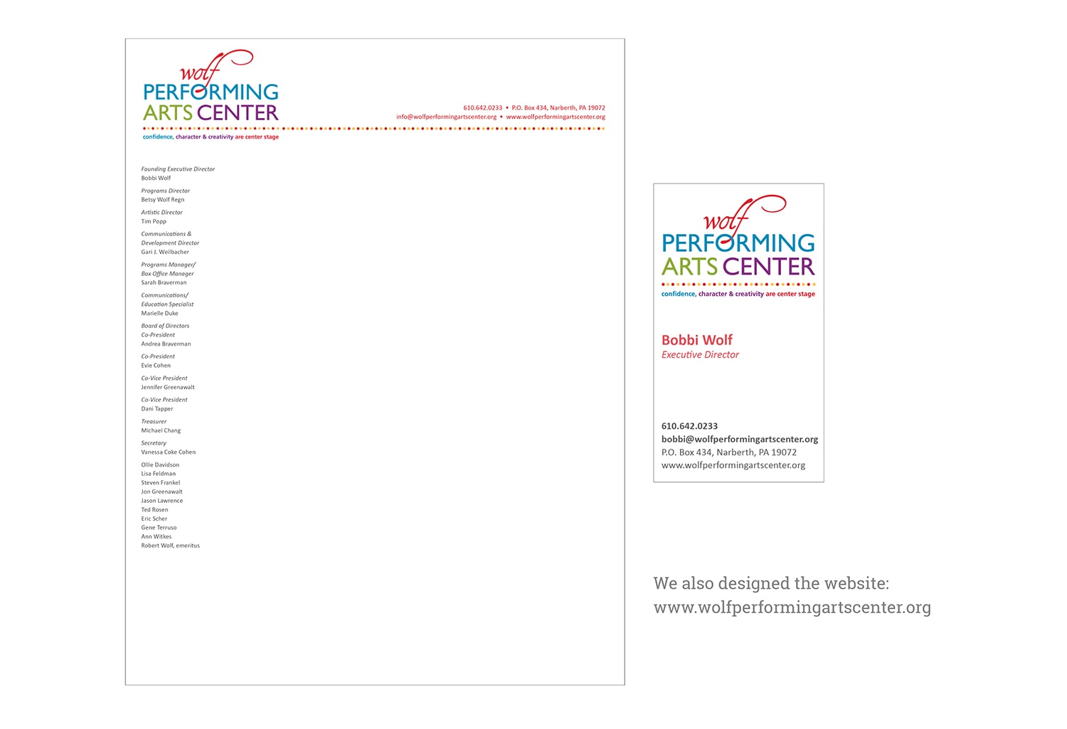
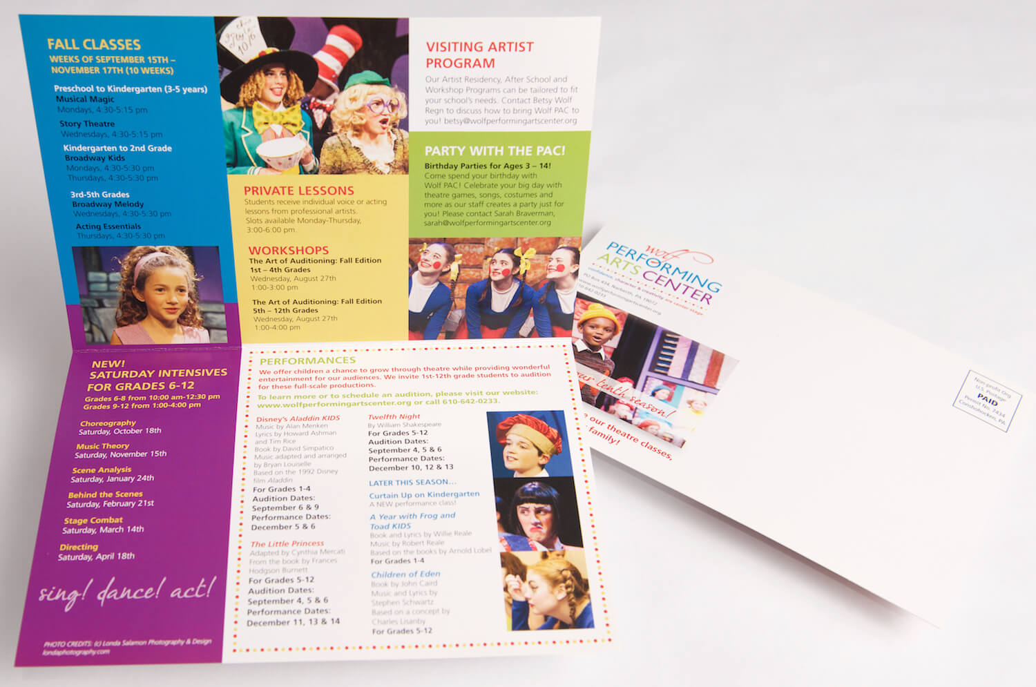
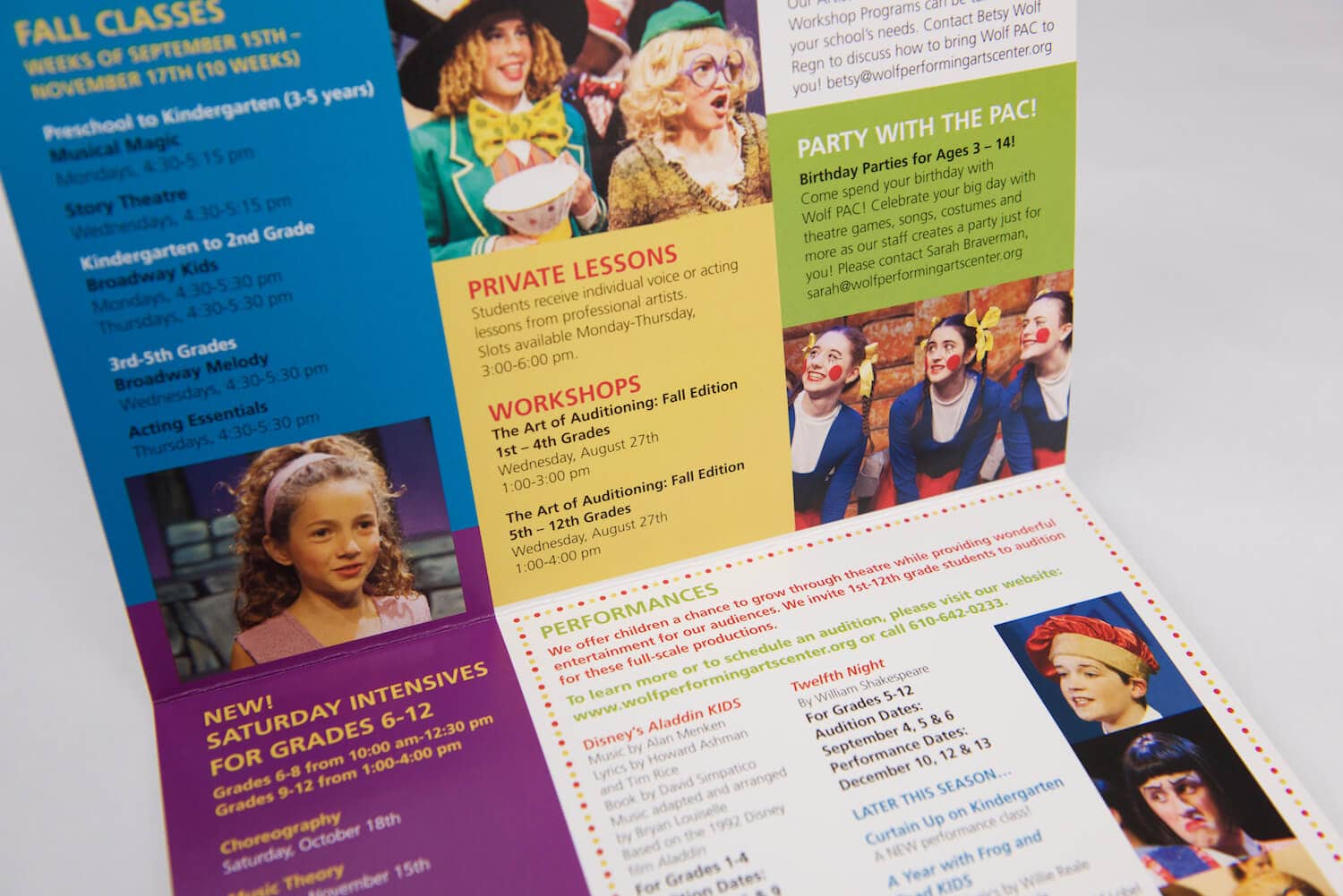
Below are the letterhead, business card, direct mail and signage that I created.
We also re-designed the website, www.wolfperformingartscenter.org.
Project:
Rebranding package including:
- Logo design
- Business card, letterhead design
- Direct mail
- Signage
- Website
Client:
Wolf Performing Arts Center
Need a whole new look? Or maybe a refresh? Get in touch to see how I can help with getting your logo and marketing materials looking fresh and consistent.
Before:
After:
